From Cluttered Chaos to Artic Cool
July 3, 2023
Wearing The Mask of Excellence: The Story Behind The Brand
August 17, 2023Commercial Vehicle Wraps:
The 8 Critical Mistakes 99% of Businesses Are Making
Vehicle wraps are more than a simple design aesthetic; they are a powerful marketing tool that can make or break brand perception. As the founder and brand director of WrapMasters, a leading company in creating brands that speak, engage, and convert, I understand the crucial role that a well-designed vehicle wrap plays in a business's success. The problem is most vehicle wraps fail to attract, engage, or convert onlookers into customers. As a result, 99% of companies are leaving an incredible amount of money on the table. This white paper outlines the eight critical commercial vehicle wrap mistakes made by companies in their vehicle wrap design, leading to this massive loss of potential revenue.
Mistake 1: Lack of Clear Brand Message
A wrap should not just be visually appealing; it must convey a brand's core message and values. Too often, businesses neglect to include a coherent and compelling message, leading to a disconnection between the brand and its audience.
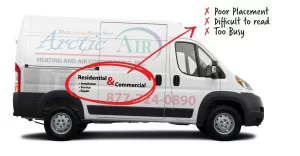
Mistake 2: Overcrowded Design
Less is often more. An overcrowded design filled with excessive images, text, and colors can overwhelm the viewer and detract from the primary message. Simplicity and clarity should be the guiding principles.
Mistake 3: Poor Quality Images and Graphics
Using low-resolution images and graphics can make the wrap look unprofessional and tarnish the brand's reputation. Investing in high-quality visuals is essential for a sleek and sophisticated appearance.
Mistake 4: Ignoring Target Audience
Understanding the target audience and their preferences is paramount. Designing a wrap without considering the audience's needs and interests will likely result in a missed connection and lost opportunity.
Mistake 5: Inconsistent Branding
Consistency is key in branding. A vehicle wrap that does not align with other brand elements such as logos, colors, and typography can confuse consumers and weaken brand loyalty.
Mistake 6: Ineffective Use of Color
Colors evoke emotions and associations. The wrong color choice can send unintended messages and fail to resonate with the target audience. A harmonious color palette that aligns with the brand's identity is vital.
Mistake 7: Lack of Contact Information
A vehicle wrap is a moving advertisement, and viewers may only have seconds to take in the information. Omitting essential contact details can hinder potential clients from reaching out.
Mistake 8: Failing to Consult Experts
Designing a vehicle wrap requires specialized knowledge and expertise. Many companies attempt to cut costs by going it alone, only to end up with a subpar design that doesn’t achieve their marketing goals. Working with experts like WrapMasters ensures that the wrap is not only visually appealing but also aligned with strategic business objectives.
Turning Your Vehicle into a Revenue-Generating Machine
Commercial vehicle wraps hold incredible potential for enhancing brand visibility and driving profits. The key lies in avoiding the eight hidden pitfalls that trap 99% of businesses. From overcrowded designs to inconsistent branding, these mistakes can cost you both money and customer trust. Leverage the expertise of professionals like WrapMasters, and you'll be on the path to transforming your vehicle into a powerful tool that speaks, engages, and converts. The future of your branding is bright, and with well-designed wraps, the growth in revenue is not just a possibility; it's a guarantee.
Contact Information
Ready to take control of your branding future? Reach out to us for tailored guidance and support in maximizing the potential of commercial vehicle wraps. We're here to breathe life into your brand and ensure that your mobile advertising is nothing short of remarkable. Contact us today at [your contact information] and discover what WrapMasters can do for your business.

