
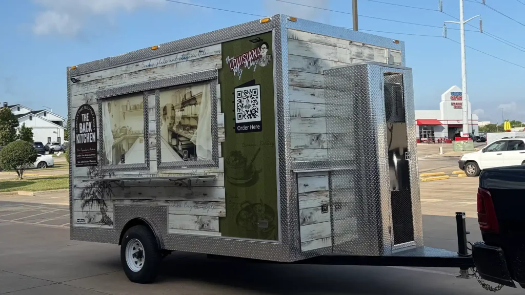
Food Trailer Wrap Case Study: The Back Kitchen
Most food trailer wraps are designed to grab attention fast. Bright colors, oversized menu items, and loud graphics dominate parking lots everywhere.
This project took a different approach.
The Back Kitchen food trailer wrap was designed as a brand environment, not an advertisement. Every detail was intentional, layered with meaning, and built to create trust before a customer ever orders food.
This case study breaks down what makes this wrap different, the hidden details built into the design, and why those details matter for brand perception, customer behavior, and long-term value.
Why Most Food Trailer Wraps Fail

Most food trailers treat the wrap like a billboard. The goal is volume, not connection.
Common problems include:
-
Too much text and too many colors competing for attention
-
No brand story, only menu items
-
Designs that look dated within a year
-
No emotional connection with customers
When everything is loud, nothing stands out.
The Back Kitchen wrap was designed to do the opposite.
A Brand Experience on Wheels

This trailer does not try to explain everything at once. Instead, it invites people closer.
Muted colors, texture, and hand-drawn elements slow people down visually. That pause is important. It gives the brand time to communicate quality, care, and intention.
The result is a food trailer that feels more like a small restaurant than a mobile vendor.
Hidden Design Details That Matter
Aged Wood Texture and Materials
The distressed wood visuals are not decorative filler. They signal history and authenticity.
Even though the trailer itself is new, the design suggests recipes, techniques, and standards that existed long before the trailer did. This builds trust instantly and positions the food as established rather than experimental.
This approach is especially effective in crowded food truck areas where most designs feel temporary.
Handwritten Notes and Sketch Illustrations
 Subtle handwritten elements and sketch-style food illustrations appear throughout the wrap.
These details reference old recipe cards, kitchen notebooks, and personal notes passed down over time. They communicate craftsmanship and care without saying a word.
People associate handwritten visuals with effort, attention, and pride in the work.
A Calm, Earth-Tone Color Palette
Instead of using aggressive reds and yellows, this wrap relies on greens, creams, and wood tones.
These colors:
-
Reduce visual stress
-
Feel familiar and welcoming
-
Separate the trailer from louder competitors
In a parking lot full of noise, calm becomes a competitive advantage.
The Illustrated Brand Character

Rather than using photography, the wrap features an illustrated character as the face of the brand.
Illustration feels timeless. It avoids trends and allows customers to project personality onto the brand. Faces are easier to remember than logos, and this character becomes a visual anchor customers recall later.
This is especially powerful for repeat visits and word-of-mouth marketing.
 The Reversed Silhouette in the Window
One of the most meaningful details is also the most subtle.
Inside the right window illustration is a reversed silhouette. It appears slightly out of visual sequence, almost like a reflection.
This reversal is intentional. It represents memory rather than presence. The figure exists as a tribute to a grandmother and granddaughter, honoring lineage and influence rather than activity.
There is no signage explaining it. No text calls it out.
That restraint preserves authenticity and gives the design emotional depth without turning it into a marketing tactic.
Interior Kitchen Illustration
Instead of hiding the kitchen, the wrap shows it.
The illustrated interior suggests cleanliness, professionalism, and care behind the scenes. It removes uncertainty for first-time customers and builds confidence before they place an order.
People trust what they can visualize.
Clean QR Code Integration
The QR code is present but not disruptive.
It provides convenience without breaking the visual story. This balance allows modern ordering while keeping the brand experience intact.
Technology supports the design rather than overpowering it.
Why This Food Trailer Wrap Is Different
This wrap does not try to appeal to everyone.
It attracts the right customers by communicating quality, intention, and story. It feels established without claiming to be old. It feels personal without oversharing.
Instead of selling food aggressively, it sells confidence.
The Business Impact of a Story-Driven Wrap
A wrap like this delivers long-term value beyond first impressions.
Higher Perceived Value
Customers expect better food and better service before seeing the menu.
Stronger Brand Recall
People remember the trailer because it feels different, not louder.
Longer Design Lifespan
Timeless design elements prevent the wrap from aging quickly.
Organic Word-of-Mouth
Customers talk about the experience, not just the food.
Why This Project Works as a Case Study
This food trailer wrap proves that design is not just about visibility. It is about meaning.
By layering story, restraint, and intentional detail, this trailer becomes a brand asset instead of a disposable advertisement.
It shows what is possible when a wrap is treated as part of a larger brand system rather than a standalone graphic.

