Brandsentials – Brand Essentials for Home Service Companies
July 26, 2024
Optimize Marketing Budget: Finding Your Way Out and Back to Why You Started
October 1, 2024Why Your Van Why Your Van Wrap Design Matters: Mastering Effective Vehicle Wrap Design
Disclaimer: Before diving into the critique, let's keep it real. We've been in the game long enough to know that sometimes, despite our best guidance, business owners have a vision they want executed to a T. And that's okay—every business has its reasons. But here's the thing: those wraps don’t belong in a "Top 10 Best" showcase. When it comes to promoting the best HVAC van wraps, there's no room for compromises that dilute a brand's potential to shine.
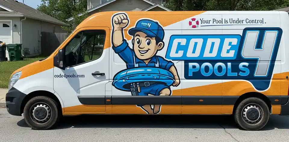
The other day, I received an email blast from a wrap company proudly showcasing their "10 best HVAC van wraps." Naturally, I clicked, expecting to see an effective vehicle wrap design. What I saw instead was a lineup of designs that missed the mark on multiple levels—cluttered layouts, unreadable text, and confusing branding messages. If these are being touted as the "best," we have a real problem on our hands. Think of this as the branding world’s version of wearing socks with sandals. Sure, they’re technically on your feet, but does anyone really think it looks good?

Received this email blast claiming these are the 'Top 10 Best HVAC Van Wraps.' If these are the best, we need to talk about what makes a design truly stand out.
Now, let’s talk about the first "Effective Vehicle Wrap Design" van wrap in question. Picture this: a cluttered mess of logos, text, and graphics, all competing for attention like a bad party where everyone talks over each other. The design is so overloaded that your eyes don’t know where to land. It’s the visual equivalent of trying to read a magazine while skydiving—not happening. What’s needed here is a design that breathes, one that knows when to let a single, powerful image do the talking. Imagine a sleek white van with a striking image of a high-tech HVAC unit, front and center. That’s how you make an impression—sharp, clean, and impossible to miss.
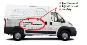
But it’s not just about space. Let’s talk text. If you can’t read the essentials—company name, core service, contact info—from 30 feet away, the design has already failed. The best wraps use bold, high-contrast typography that pops. Think about deep blues or rich reds set against a crisp white background. It’s not just about being seen; it’s about being remembered. And speaking of being remembered, your logo needs to be more than just an afterthought buried under visual clutter. A well-placed logo should dominate, ideally layered over a powerful image that tells your brand’s story in an instant.
Then there’s the lack of a call to action—a cardinal sin in the world of van wraps. What good is a mobile billboard if it doesn’t prompt the viewer to do something? “Call Now for a Free Inspection!” or “Text ‘COOL’ to 12345 for Instant Service!” should be bright, bold, and impossible to ignore.
And placement? How about on the rear doors, where it’s guaranteed to be seen when it matters most, like when potential customers are stuck behind you at a stoplight? And don’t even get me started on the Trane logo that looks like it was tacked on at the last minute, with no thought given to how it fits into the overall design. The best van wraps know how to integrate partner logos seamlessly, creating a visual narrative that feels intentional and cohesive.
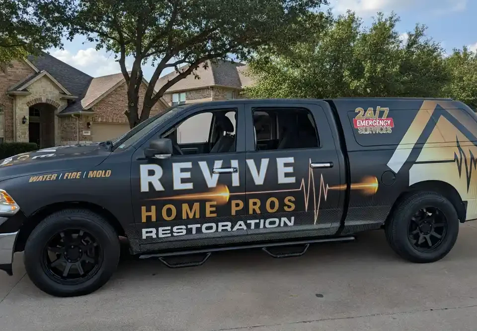
Now, onto the second van. Overloading a van wrap with every possible service you offer isn’t just overwhelming; it’s ineffective. Instead of throwing a laundry list at viewers, focus on a core message that resonates. Imagine a single, powerful statement like “Energy-Efficient HVAC Systems,” paired with a striking image that says it all. And let’s talk color. Black and white might work for an indie film, but it doesn’t cut it on a van wrap. You need contrast—something that grabs attention and holds it. Think about a gradient from blue to orange, symbolizing cold and warm air, instantly telling the story of HVAC without uttering a single word.
But it’s not just about what’s on the wrap—it’s about how the eye moves across it. Visual hierarchy is key, guiding viewers from your brand name to the service offering, and finally, to a strong call to action. Important details like “24/7 Emergency Service” should dominate, not disappear into microscopic text. And while we’re at it, let’s rethink that cloud imagery—unless you’re a weather service, it’s probably not doing you any favors. Every element should reinforce your brand’s core message, like a visual narrative of cool and warm airflow that connects instantly with your audience.
Creating the best HVAC van wraps isn’t about slapping a few graphics on a van and calling it a day. It’s about strategy, purpose, and knowing your audience. Are you targeting busy professionals who value convenience? Then show a van speeding through a cityscape with a bold “Same-Day Service, No Downtime” tagline. If your audience is eco-conscious families, green hues and messages like “Reduce Your Carbon Footprint by 30%” will resonate.
And differentiation? Forget the clichés about being the best or offering great service. Everyone says that. What really sets you apart? Maybe it’s your expertise in high-efficiency systems or your reputation as the go-to for heritage home HVAC solutions. Your wrap should communicate that difference immediately and clearly, through visuals and messaging that are anything but generic.
At the end of the day, a van wrap should do more than just look good—it should work hard for your brand. It’s about creating something that grabs attention, drives engagement, and ultimately, converts onlookers into customers. It’s about making your van a moving billboard that turns heads and drives business, all day, every day.
So if you’re ready to leave the world of “Where’s Waldo” van wraps behind and step up to something that truly represents your brand’s potential, it’s time to rethink your strategy. And when you’re ready to make that leap, you need more than just a designer—you need a partner who gets it. Someone who knows how to translate your brand DNA into a wrap that not only stands out but also drives real, measurable results.


