Royal Garden Landscape | Design
Logomark
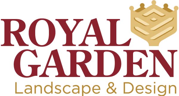
At the heart of the brand, the rose and crown symbolize not just the commitment to beauty and excellence, but also the elevated service Royal Garden provides. The gold and deep burgundy colors were chosen to signify luxury and sophistication, resonating with the brand's upscale positioning.
Typography
A traditional font for the company name pairs with a modern font for the services, striking the perfect balance between classic elegance and contemporary sophistication. This choice is strategic, aiming to appeal directly to their target market of affluent families, particularly appealing to the decision-maker: the female head of the household.


Pattern
The intricate pattern within the rose serves a dual purpose: it represents the elegance of a rose, while also drawing on the noble tradition of using symbolic elements in family crests. This ties the brand to a heritage of royalty and excellence.
Truck Wrap
The design for the Royal Garden Landscape & Design truck leverages the vehicle's original black color to provide a sophisticated backdrop to the partial wrap. This is complemented by a deep burgundy stripe with a white accent, both finished in gloss to match the truck's inherent sheen. Against this, a matte gold panel serves as a background, offering a subdued contrast and softening the overall aesthetic. This thoughtful interplay of gloss and matte finishes, along with the strategic use of the truck's inherent color, results in a tailored and upscale look that embodies the brand's promise of luxury and refinement.

